Using the Dashboard
The Dashboard is a mobile-friendly version of the Dashboard found in the ChangeGear Web client. It provides an at-a-glance overview of Key Performance Indicators (KPIs) in the form of graphs and charts.
Note: Only staff users can view this page.
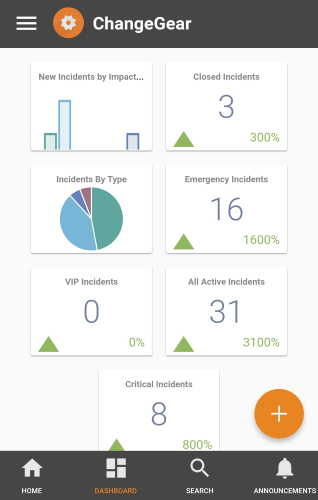
The Dashboard consists of widgets such as bar charts, pie charts, and Score Cards. The contents of the Dashboard reflect the contents of your default Dashboard in the ChangeGear Web client. The date range set to the current year.
Note: The Dashboard cannot be modified from within the app.
Dashboard Widgets
The mobile Dashboard supports the following widgets:
-
Pie Chart: The Pie Chart widget displays individual data points as percentages of a whole. You can view the value of a single slice by tapping on it.
-
Bar Chart: The Bar Chart widget displays a comparative chart of data points represented as a series of bars.
-
Line Chart: The Line Chart widget displays one or more data points plotted out over a period of time.
-
Score Card: The Score Card widget displays a specific data point, such as the number of new incidents. The Score Card also uses data collected over time to display trends.