Getting Started with Design Studio
The Design Studio workspace is flexible and gives you options to work the way that you want. Following are some of the more important parts of navigating the Design Studio workspace.
Home Screen
-
In ChangeGear Web, click the Administration tab.
-
Under the Platform node, click Design Studio. This takes you to the Design Studio Home Screen.
The home screen offers an "All Apps" card as well as a card for each app. Clicking any app tile will bring the user to the Components Screen for the app, which will only display the components that pertain to the selected app.
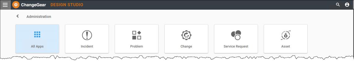
The following apps are available in the Design Studio.
-
Incident
-
Problem
-
Change
-
Service Request
-
Asset
-
CMDB
-
Knowledge
-
Survey
-
Announcement
-
Any custom modules licensed
Note: Apps displayed in Design Studio consist of the apps licensed to your ChangeGear product. Some app names are slightly different from the module names in ChangeGear Desktop Client.
Component Screen
The Component Screen displays all components available within the app for the user to set up and configure. The components listed depend on which card was clicked on the Home Screen.
Example: Incident
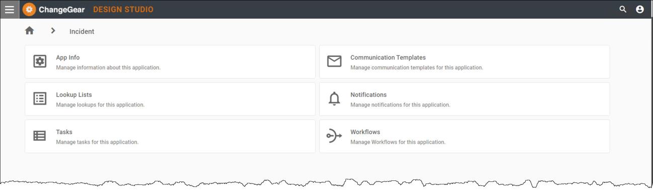
Available components:
-
App Info
-
Lookup Lists
-
Approval Groups
-
Communication Templates
-
Notifications
-
Workflows
-
Change Windows (specific to the Change App/module)
-
Blackout Dates (specific to the Change App/module)
-
Tasks
Navigation
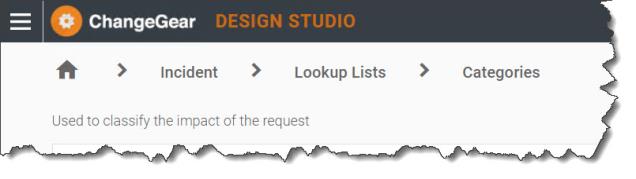
With the exception of the Home Screen, breadcrumb navigation will display at the top of every screen in the Design Studio. The breadcrumb feature allows you to effortlessly traverse the different areas within the navigation bar.
The navigation bar format:
Home Icon > App > Component > Component Name > Sub-Component Name
Example:
See also: