Using the Dashboard
Access the Dashboard by opening the ChangeGear navigation menu  and selecting Dashboard. ChangeGear presents one of several preset Dashboard layouts depending on your current persona. Each user is also provided with a personalized Dashboard called My Dashboard, which you can customize with your own set of widgets.
Note: You may not have access to all these ChangeGear features depending on your permissions or ChangeGear edition.
Selecting a Dashboard
Depending on your privileges, you can view multiple different dashboard layouts. Click the layouts drop-down in the top-left corner of the Dashboard to open the list of dashboards available to you. Dashboards are listed in the following order:
|
|
|
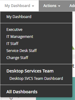
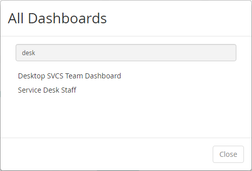
To view a list of dashboards, click the All Dashboards option. This opens a dialog where you can select from and search for dashboards that you are the owner of, or that belong to a team that you are a member of. Click on a dashboard to open the dashboard.
Role vs. Persona
By default, ChangeGear displays one of several Dashboards depending on your persona. Each role has a persona assigned to it, and the persona determines the layout of the default dashboard for users in that role. The default layouts are designed to provide information used in a typical business scenario by users in that persona. ChangeGear provides default layouts for the Change Staff, Executive, IT Management, IT Staff, and Service Desk Staff personas. With the proper permissions, you can modify and publish persona layouts to suit your needs. Refer to Managing Dashboards and Workspaces for more information regarding permissions and publishing.
Dashboard Widgets
The Dashboard provides several configurable widgets for displaying information from ChangeGear. Widgets are separated into two categories: standard and predictive. Standard widgets are the traditional ChangeGear widgets and display historical data in the form of charts and graphs. Predictive widgets also consist of charts and graphs, but they display potential future data that has been generated by analyzing historical data. In other words, standard widgets summarize the past and present state of the system, while predictive widgets summarize the possible future state of the system.
Note: With the exception of the Custom HTML and Predictive Line Chart widgets, all widgets are based on the reports defined in the Reports module. For more information, see Using the Reports Module under the Reporting chapter.
Standard Widgets
-
Pie Chart: The Pie Chart widget displays individual data points as percentages of a whole. The chart also displays the value of each slice. Clicking on a slice of the chart opens a grid view of that slice in the respective module.
-
Bar Chart: The Bar Chart widget displays a comparative chart of data points represented as a series of bars. Clicking on a bar opens a grid view of that data point in its respective module.
-
Line Chart: The Line Chart widget displays one or more data points plotted out over a period of time. Clicking on a point opens of a grid view of that point in its respective module.
-
Bubble Chart: The Bubble Chart widget displays a sum of data points grouped by two criteria. Each bubble represents the number of items matching both criteria. Clicking on a bubble opens a view of the items in that bubble.
-
Donut Chart: Similar to the Pie Chart widget, the Donut Chart widget displays data points as a percentage of a whole. However, it displays each data point as a slice of a ring rather than a slice of a circle. Clicking on a slice opens a view of the items in that slice.
-
Gauge: The Gauge widget displays the value of a data point on a scale from 0 to 100. It is especially useful for comparing a percentage to a certain threshold, such as SLA compliance.
-
Score Card: The Score Card widget displays a specific data point, such as the number of new incidents. The Score Card also uses data collected over time to display trends.
-
Custom HTML: The Custom HTML widget lets you add your own custom HTML to the Dashboard. This widget is useful for referencing a third-party web page or web component within the Dashboard.
Predictive Widgets
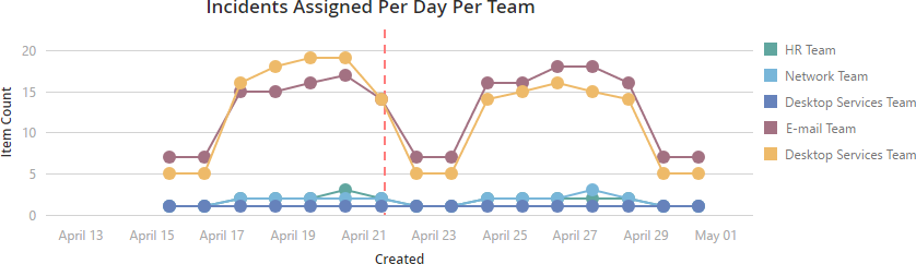
Predictive widgets are similar to their corresponding standard widgets, except they display predictions instead of historical data. Predictions are calculated by analyzing and identifying trends in existing ticket data. These trends are then displayed on the widget as anticipated values, rather than actual historical values. As a result, predictive charts do not support drill downs.
Tip: Predictive Charts are indicated by an icon ![]() in the top-left corner.
in the top-left corner.
The following image shows an example predictive line chart. The dotted red line indicates the date that the report was generated, and acts as a separator between the historical data and the predicted data.
The following predictive charts are available:
-
Bar Chart
-
Line Chart
-
Pie Chart
-
Donut Chart
-
Score Card
-
Gauge Chart
Date Range and Date Slider
You can apply a specific date range to your Dashboard widgets by selecting from the date range drop-down in the Dashboard menu. For example, selecting Last 6 Months will refresh your Dashboard widgets with data collected within the last 6 months. This does not impact the Custom HTML widget. You can also fine tune the date range by using the date slider located at the bottom of the Dashboard.
Tip: If your Dashboard contains predictive charts, set the ending date after today's date to display predictive data.
Score Card Trends
The score card widget shows a trend arrow ![]() and percentage representing the amount of change between the current time frame and the previous time frame of the same duration. For example, after setting the date range set to Today, a score card widget calculates a trend by comparing today's value with yesterday's value. Setting the date range to Current Month compares this month's results with last month's results. The percentage of change is calculated by taking the current count, subtracting the previous count, and dividing by the previous count. The trend arrow shows an up arrow for a positive trend and a down arrow for a negative trend.
and percentage representing the amount of change between the current time frame and the previous time frame of the same duration. For example, after setting the date range set to Today, a score card widget calculates a trend by comparing today's value with yesterday's value. Setting the date range to Current Month compares this month's results with last month's results. The percentage of change is calculated by taking the current count, subtracting the previous count, and dividing by the previous count. The trend arrow shows an up arrow for a positive trend and a down arrow for a negative trend.