Creating and Editing Pie Charts
In the Report Designer, you can create pie charts which are circular diagrams split into sectors. The size of each sector is proportional to the quantity of tickets/items in the module. You can define which module columns are represented in the pie chart sections and apply additional filtering to further refine the scope of data represented.
To create a pie chart report:
-
Click Reports on the primary ChangeGear navigation menu.
-
Click the New icon
 in the reports tool bar.
 -
The Report Creation dialog displays. Select the Pie Chart report.
-
Select a module type for the table data used to create the report, (e.g., incident, problem, CMDB, assets, etc.). For example, select the Incident module to create a report regarding Incident tickets.
-
Select a view for the report, (e.g., All Incidents, Active Incidents, Closed Incidents, etc.). When a pie chart is based upon a view, that report uses the same filter criteria as the view.
-
Click Next. The Pie Chart Creation screen displays.
-
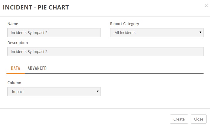
Enter the Name of the report.
-
Optionally, you can enter a Description for the report.
-
Select Report Category from the list. The Report Category determines which category within the module to save the report. The My Reports category saves the report in your own My Reports and is not visible to other users.
Data Tab
The Data Tab allows you to define the column used to establish the sectors of the pie chart.
-
The Column field allows you to specify which module table column to represent in the pie chart.
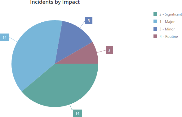
For example, suppose you want to show the total number of incident tickets by their impact. You would set the Column field to Impact. The generated pie chart renders each unique impact, (e.g., Major, Significant, Minor, Routine), as a section of the pie chart and each unique impact has a separate section showing the total number of incident tickets in that location.
Note: A pie chart widget supports up to five segments. If the column field has more than five unique values then the pie chart shall display the five largest segments.
Advanced
You can optionally apply basic data filtering to the data displayed on the pie chart. Please refer to the Filtering Columns Table Report section in Creating and Editing Table Reports.
Filter
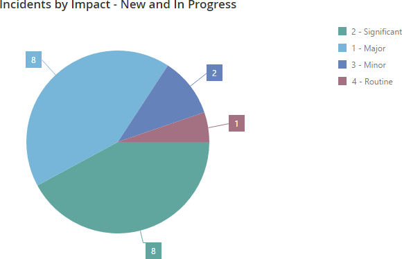
This filtering allows you to further refine which tickets/items to include in the pie chart other than the column selection in the Data Tab. You can optionally apply filtering to the ticket counts. This filtering allows you to filter which values are used to count tickets displayed on the pie chart.
For example, suppose you want to include only New and In-progress tickets for the locations shown on the pie chart. In this case, to Match Any Condition, set the Select Field to Status and the value to New to establish your first filter criteria. Add another filter to include Status with a value of In-progress. The generated pie chart renders a sector for each unique location name but only includes the filtered in tickets.
Create Report
The report is rendered after saving the report. To create the report, click Create.
Note: You can create new reports from existing reports by using the Save As option.
Editing a Pie Chart Report
ChangeGear allows you to edit a pie chart report and modify the filter criteria and other criteria similar to creating a table report.
To edit a pie chart report:
-
Click Reports on the primary ChangeGear navigation menu.
-
Select a Pie Chart report from the Reports Module grid.
-
Click the Edit icon
 fromthe pie chart tool bar.
 -
You can edit the Description as necessary.
-
The system allows you to change any report Data Tab and Advanced options as shown above in the Create a Report section.
-
Click Save.
Note: You can create new reports from existing reports by using the Save As option.