Workflow Designer
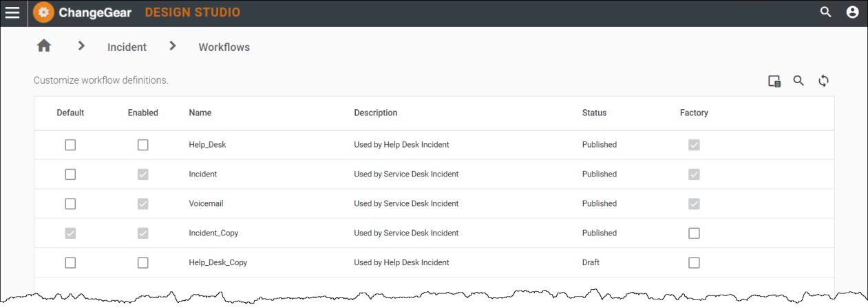
Business workflows can be quickly designed and configured to align with your business needs using the new WYSWYG (What You See Is What You Get) web workflow designer. You can access it via Design Studio > All Apps > Workflows or from within a specific app (i.e. Design Studio > Change > Workflows). From here, the Workflows Screen displays as shown in Figure 1.
Figure 1: Workflow Screen
When you hover over a workflow in the grid, you'll see options to Edit, Delete, Design, and Copy as shown in Figure 2.
You can also double-click on a workflow, which takes you straight to the Workflow Designer.
Figure 2: Workflow Grid Options

-
Edit
 lets you modify the row options in the grid, including enabling the workflow and/or setting it as the default workflow.
 -
Delete
 can be used to delete a workflow.
Note: Factory workflows cannot be deleted; therefore, the Delete option is read-only.
-
Design
 opens the workflow. You can view the workflow in it's entirety or save it as a new workflow to modify in the Workflow Designer.
 -
Copy
 will create a copy of an existing workflow in the grid for you to modify.
Note: As a best practice, remember to change the name of the workflow after a copy.
After you select an option for a workflow in the grid, the Workflow Designer displays.
Getting Started with the Workflow Designer
Using the Workflow Designer, you can
-
Customize and configure your workflow from start to end
-
Add or update states and transitions
-
Set up business automations to run when actions are triggered on tickets
Note: Depending on your role or license restrictions, you may not have access to the Workflow Designer. For questions regarding access to the Workflow Designer, contact your ChangeGear Administrator or Serviceaide account representative.
The Workflow Designer is comprised of a Top Navigation Bar, a Left Panel, and the Main Content Area as shown in Figure 3.
Figure 3: Workflow Designer Canvas
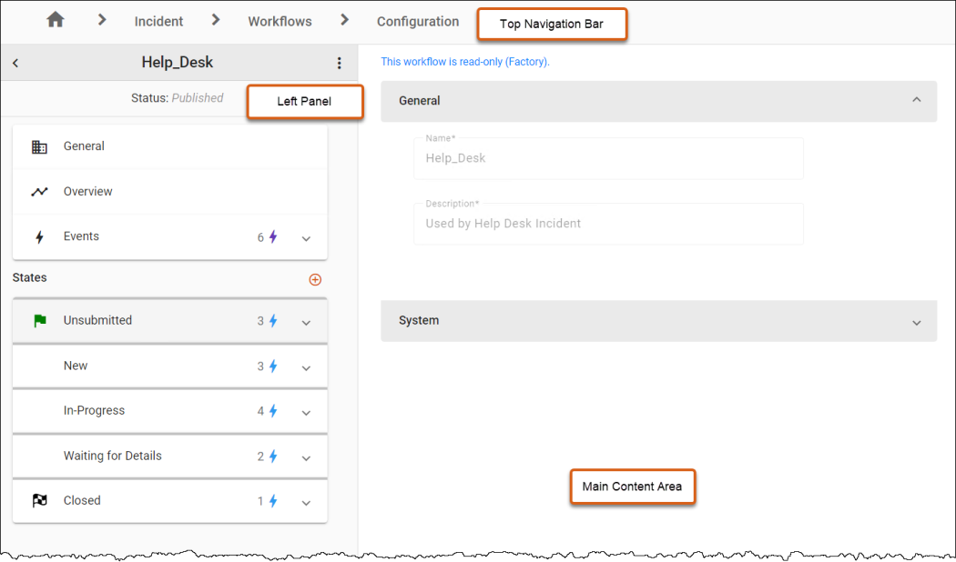
Top Navigation Bar
The top of the screen includes a breadcrumb menu to help you navigate through the different components of Design Studio.
Left Panel
The Left Panel serves as a control panel for building the workflow and consists of:
-
Warning and Critical Indicators: Allow you to spot issues in your workflow that require attention.
-
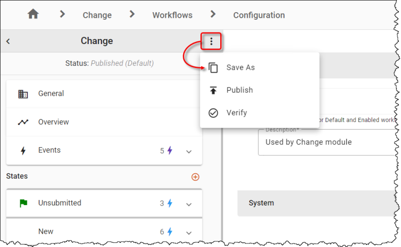
Three-dot menu: Reveals or hides options, including Publish and Save options.
-
Workflow Search Bar: Highlights matching states, transitions, or events when a workflow search term is entered.
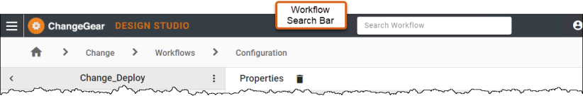
This allows you to select an option and navigate to the corresponding item.
-
General and Overview: Display properties and a high-level view of your workflow.
-
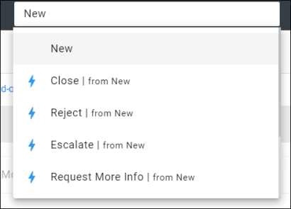
Events: Events are actions that can be triggered without a transition to another state. In the "Events" view, you can manage and configure actions that occur independently of the state transitions. For instance, an event can be set up to send an email notification when a deadline is approaching, regardless of the current state of the task. Automations are supported on all events.
-
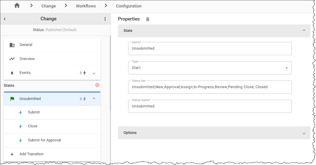
States: The "States" view provides a visual representation and management interface for the different states in a workflow. In this view, you can define how the workflow behaves when an item is in that state, including transitions and the actions that can be taken, automations, rules that apply, and the information displayed. By defining these states, the "States" View outlines the progression path a workflow item will follow, and includes conditional transitions that move items from one state to another based on defined triggers or criteria.
Main Content Area
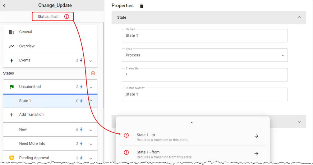
The Main Content Area is the dynamic work area used by various workflow design elements. For example, if you click on a state from the left panel, you'll see properties for the state in the canvas as shown in Figure 4.
Figure 4: State Properties
If you click on a transition within a state from the left panel, you'll see the corresponding action and its flow along with the properties for the action, including transitions and rules as shown in Figure 5.
Figure 5: Action Properties
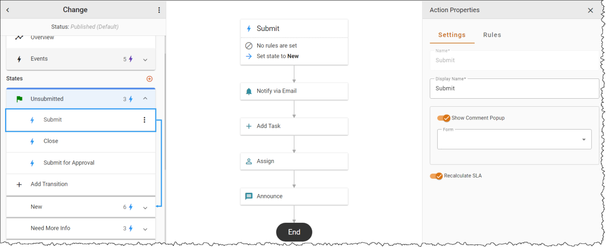
Actions are the building blocks of a workflow, representing tasks or operations that are performed at certain steps in the workflow. Actions in ChangeGear can trigger automations, which could include sending an email and/or SMS notification, updating a database record, or publishing announcements. Actions trigger transitions to move an item or ticket from one state to another. New actions create new privileges that you must enable per role.
Transitions determine the flow between states within a workflow. They are the connectors that define what happens next after an action is triggered. Creating a transition through the Add transition option from a state automatically generates a corresponding action if it doesn't already exist, facilitating the setup of rules and automations on that action. This design allows for the configuration of multiple transitions with the same name from various states to a single end state.
For example, you can establish multiple 'Close' transitions leading to the 'closed' state. If an action named 'Close' is associated with these transitions, executing the 'Close' action from a ticket form triggers the specified rules, the state transition, and the automations.
Click on the links below to explore elements of the Workflow Designer: